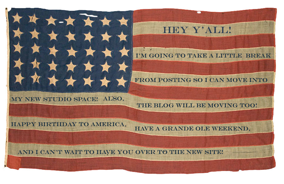
Thursday, June 30, 2011

moving...

american as pie..

hey y'all!

i'm taking a break from posting so i can move into my new studio space and work on getting my new site up and running! so many changes going on around My Favorite Color is Shiny. can't wait to see you when it's all fixed up! thanks for reading this up until now, and i've loved all the sweet emails y'all have sent. you darlings are the best!

xoxo,
GBS

moodboard: embroidered wallpaper...

wallpaper

wallpaper 2


claire coles has been a longstanding source of inspiration, ever since i learned about her back when i was at SCAD. her embroidered wallpaper is mindblowingly gorgeous. i am itching to give this a try over layers of peeled wallpaper. now all i'll have to do is dust off my sewing machine and give free-motion embroidery a go again.

also, have you seen amy osaba's installation she and her crew(erica and maria) created for the not wedding? their cut paper flowers deliver a similar look without the need of a sewing machine. inquiring minds should pop over to her blog!

Wednesday, June 29, 2011

moodboard: graphic love

graphic love

graphic love 2

the work of dana tanamachi is super inspiring. we've all seen chalkboards used in every configuration, but her grand scale and use of old-timey, turn-of-the-century handlettering knocks my socks clean off. i started collecting items that i thought could compliment a wedding inspired by one of her pieces.

personally, i think the merchant and mills website is full of ways to incorporate graphic elements without it being overly designed. lots of potential escort cards, favor gifts, and bunting supplies. also a great source for any dressmakers or tailors who are getting married and want to bring in a few touches from their trade!

i also can not shake the idea of incorporating dark as night blooms into the mix. black hellebore? amazing. and that black magic elephant ear is delicious. throw in some black and white anemones, silver brunia, and dusty miller and call it a day!

white hot...

white

yes my friends, the time has come where i passive-aggressively gripe about the heat. in an effort to surround myself with all things soft and soothing, i have been seeking out light and airy imagery. i hope this little slice of white can bring some sort of cooling effect through the computer... is it working yet? here are the lovely white links...


wet your whistle...

summer drinks

oh georgia, once again your summer heat is holding me hostage. i am practically hugging my little bedside fan, and imagining all sorts of different delicious cold libations. these two images will definitely be my jumping off points!

p.s how charming are haley's illustrations?? go check out her blog immediately for more watercolors of edibles and potables.

Tuesday, June 28, 2011

southern garden party...

sb 4

sb 3

sb1

sb 2

{first three images: marcus hay, panteek, etsy}
{all photos from simply buckhead taken by the talented renee brock}

here's a little entertaining story i styled for simply buckhead. under the themes "upscale garden party" "pool party" and "southern supper" i created three different tablescapes featuring items from local buckhead shops. i just wanted to mix up it up- elegant silver with vintage floral plates and terracotta accents.

the owners of owen lawrence kindly loaned me some of their utterly timeless silver. the floral plates and napkins are from this adorable shop, urban cottage and the little glass cloches are from hill street warehouse. a fun fact about this estate, pemberley, is that it once hosted a gone with the wind premier party in the 30s and clark gable was a guest!! Can't get more atlantan than that!

design*sponge book...

Design Sponge at Home (Official Book Trailer) from The Panic Room Videos on Vimeo.


i am dying for this book to come out which is now available for pre-order! and how cute is this video with d*s founder grace bonney???

Monday, June 27, 2011

andie's specialty sweets...

andiespecialtytreat

i stumbled upon andie's specialty sweets shop today via bonafide bride and fell in love! that candy necklace is such a clever twist on the traditional sugary circles on a string. and those candy buttons are faaaaaaar more charming than ripping bright colored dots off a strip of paper. don't miss her mushroom series either, totally perfect for a fall wedding!

Sunday, June 26, 2011

pinning for raw color...

raw color design studio

pinterest is a dangerous black hole for inspiration cataloguing. i find it to be one of the biggest blessings for keeping track of sources, but man it sucks me in! i recently discovered raw color and am absolutely smitten with their exploration of color. their homemade paint chips could be super cute for place card/escort cards. or a handmade solution for gift tags! i think it could be a fun way of making paint chips to send to your bridesmaids to let them know your color palette(if you are kind enough to let them choose their own dress).

moodboard: midnight in paris

midnight in paris marion

MIP bridal

new favorite movie? midnight in paris. time travel. 1920s and turn of the century paris. f. scott and zelda and all the great artists of the 20s and belle epoque. secret parties at the deyrolle replete with dark, moody interiors and gorgeous taxidermy. a nostalgia store. beaded flappery goodness. i hope this film translates into some gorgeous real-life wedding... stuffed animals included ;)

Wednesday, June 22, 2011

moodboard: english garden bride

campion-brightstar3

english garden inspiration

{first photo: jane campion's bright star}


earlier this month i got to act out my fantasy of an english garden bride. drawing inspiration from equal measures bright star and i capture the castle( ok, maybe a little anne of green gables too). i tried to create a wild and rambling rose kind of a bride(two actually!). jeremy gave me a sneak peek from our shoot and i am itchin' to share, but i have to wait a leetle bit longer. here is a little moodboard i had drummed up for our shoot for the meanwhile...

Sunday, June 19, 2011

ginny branch styling and designs...

business card-3

so i started a facebook page with my styling portfolio while my website gets up and running, so pop on over when you get a chance! i have a lot more new work coming soon! in addition to prop and wardrobe styling, i am also available for creative consulting and personal shopping. email me for prices and rates or just to chat. my new work email is ginnybranchstylist(at)gmail(dot)com.

also, here is a glimpse of my first for realz business card. emma robertson is the talented graphic designer, not to mention rue magazine intern and knitter extraordinaire. oh, and just all-around adorable girl to boot!

Thursday, June 16, 2011

1930s engagement shoot:katie and martin

katie and martin 3

katie and martin jewelry shot 1

katie and martin 2

katie and martin jewelry shot 3

katie and martin 1

katie and martin jewelry shot 2

katie and martin willow

katie and martin 4

katie and martin 5

so here is the engagement shoot with katie and martin! their chemistry is pretty electric, not to mention they both have pretty sharp senses of humor that kept us all in stitches throughout the day. for more pictures of this story, pop on over to the brides cafe!

thank you to all my favorite talented peeps on this shoot:

photography: jeremy harwell

prop, wardrobe, floral styling: me (ginny branch stelling)

hair and makeup: mara z

all jewelry featured: mucklow's fine jewelry

stylist assistant and talented merchandiser: brent gipson (he gets all the credit for the red and white cherry photo!)

moodboard: 1930s engagement shoot

mucklows shoot
mucklows 2


later today i am going to post the pictures from a shoot i styled for mucklows fine jewelry. we shot the engagement story in senoia, the town where part of fried green tomatoes was filmed. it truly is the town that time forgot. gorgeous 100 year old white farmhouses punctuate the charming historic community and every corner is marked by a variety of humble churches and chapels. my colors were totally plucked from the environment: the dusty blues of the cornflowers and sun-bleached denims; the whites of the houses and chapels; and the yellows of the shopfronts and wildflowers. and of course, i love me some 1930s influences.


Thursday, June 9, 2011

artists j'adore: anandamayi arnold

anandamayi arnold surprise balls

sorry i've been absent around these here parts. weddin' season is in full-swing and i am a busy little bee! love business is no joke! i am currently taking a break from clipping tree limbs(don't ask) and i cracked open my newest world of interiors to find the most jaw-droppingly lovely creations from artist, anandamayi arnold. jordan ferney first alerted me to her work and it is so wonderful to see her crepe paper surprise balls being celebrated in such a highbrow editorial! the photos particularly remind me of mary delaney's paper cuttings, especially the way the photographer aya brackett shot the story! i'm adding one of miss arnold's breakfast radishes to my christmas wish list!
Related Posts with Thumbnails

copyrights. credits. recognition...

hey y'all, if i have not given proper or accurate credit to a photo on this blog, please let me know. everything i post is meant to be shared in the most positive, complimentary fashion. if you see a photo of yours and you would like me to remove it, please do not hesitate to ask and i will do so immediately.